

Our approach
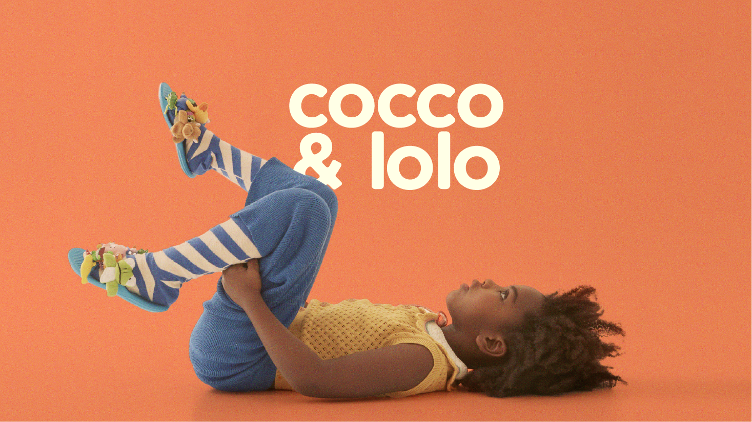
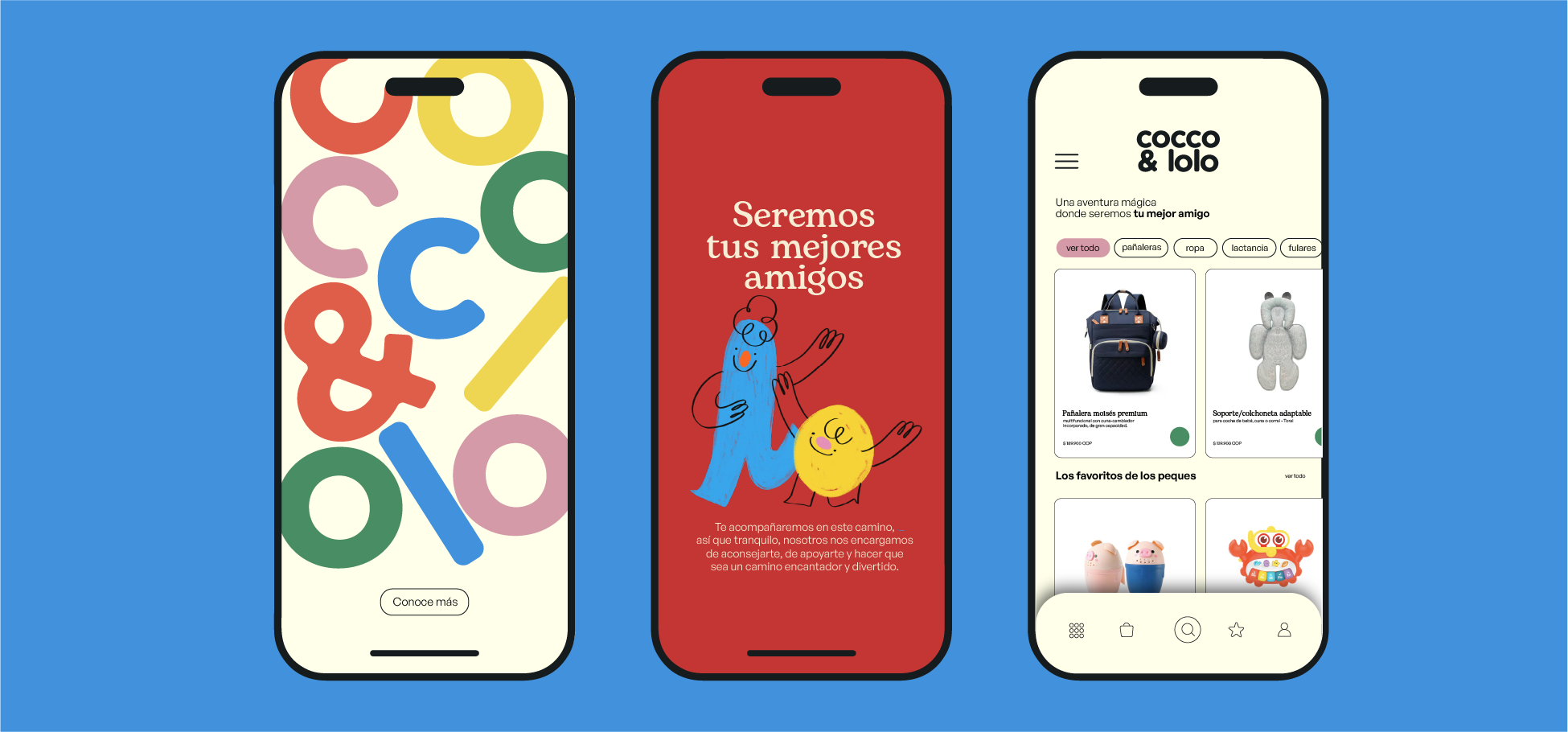
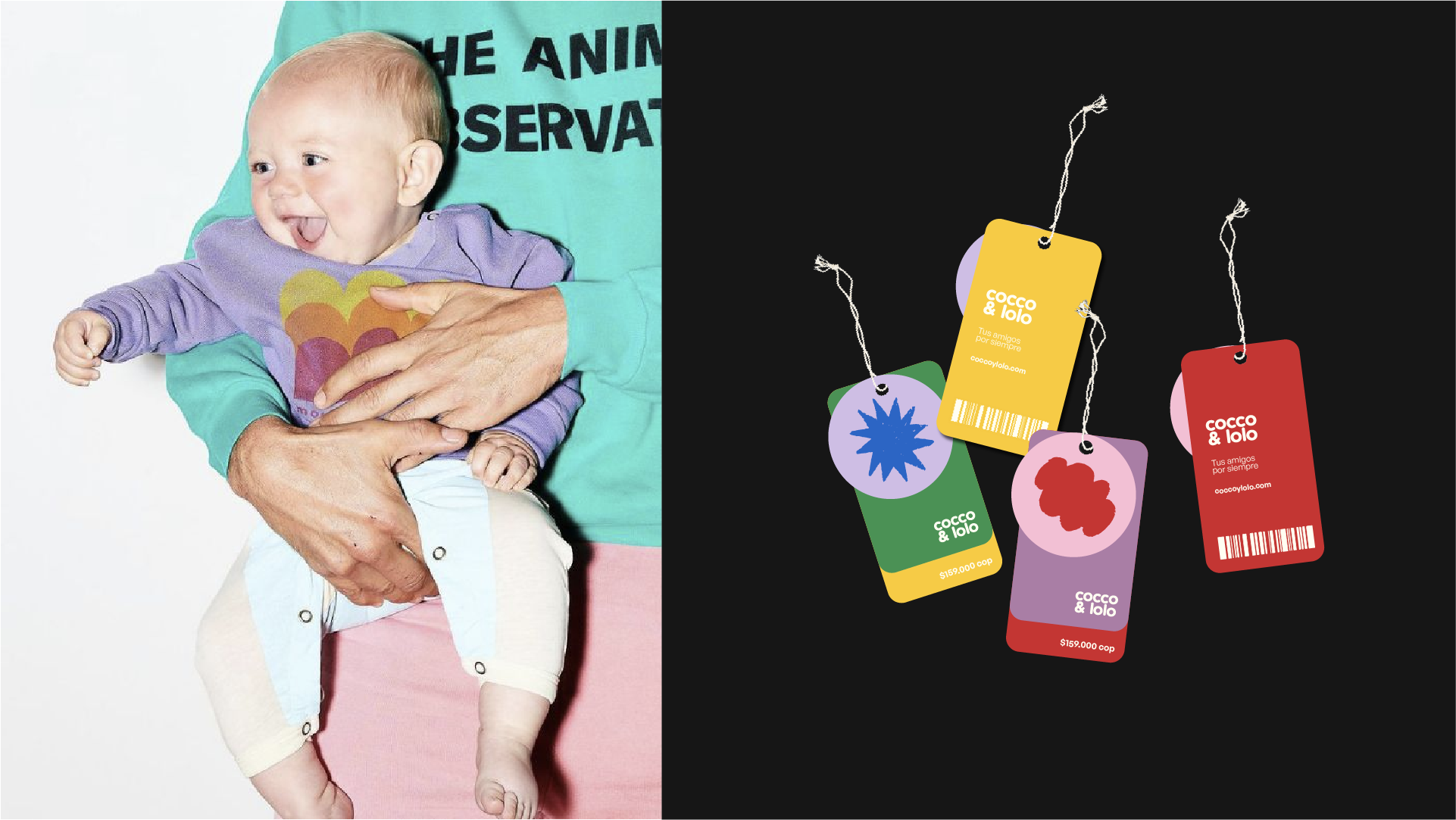
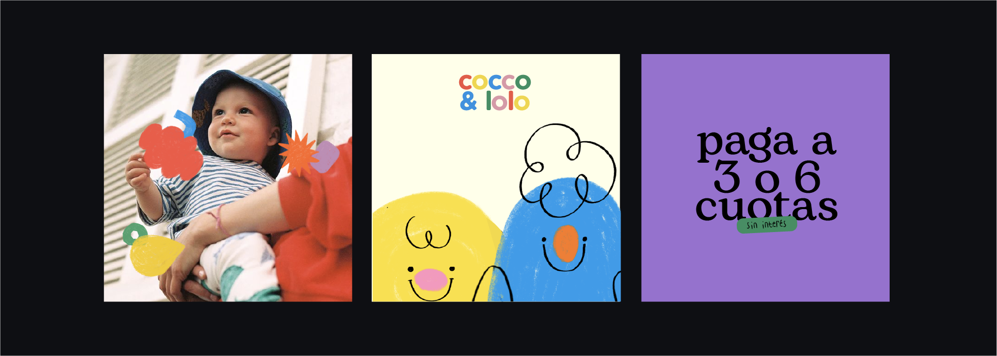
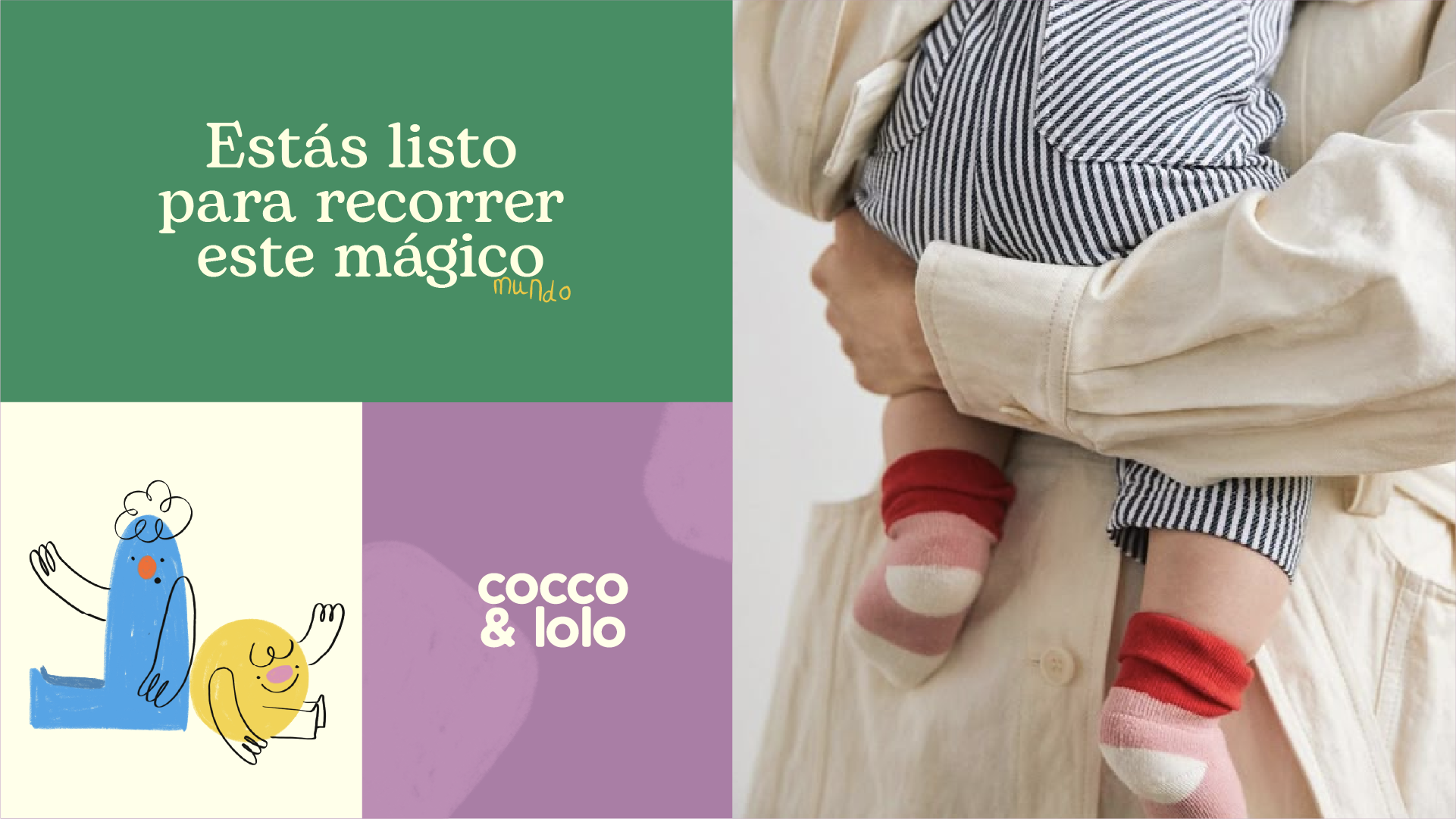
We turned the brand into a magical world created by children. Strokes, illustrations, and typography follow a childlike aesthetic. The palette uses bold primary colors, evoking the freedom of drawing and play. We also created characters—Cocco and Lolo—as brand mascots to spark emotional connection.
The outcome
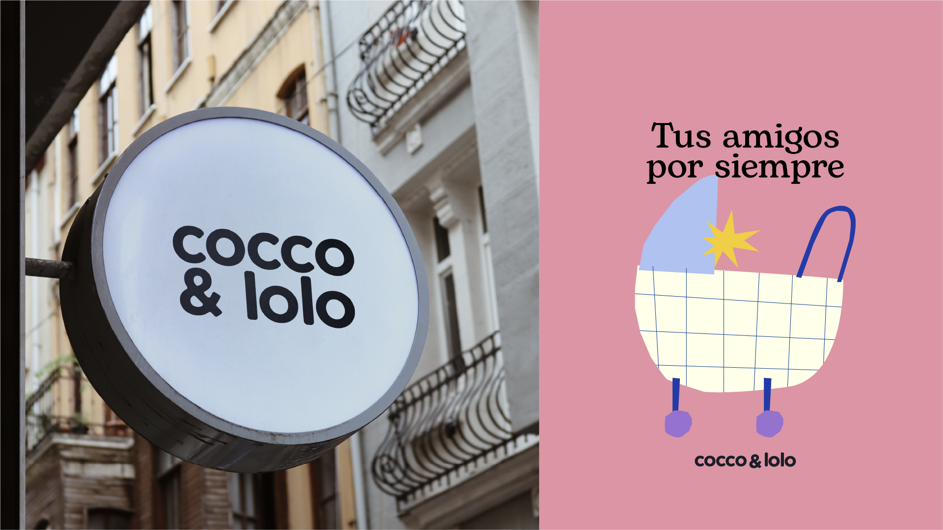
A children’s brand that is distinctive, vibrant, versatile, and dynamic. Cocco y Lolo became a living graphic universe, blending commercial appeal with conceptual depth—far from the predictable codes of the category.
No items found.