Our approach
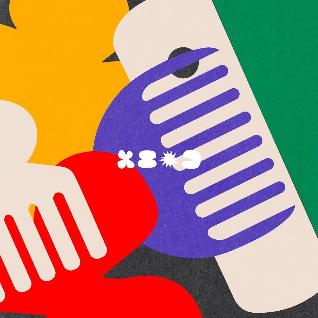
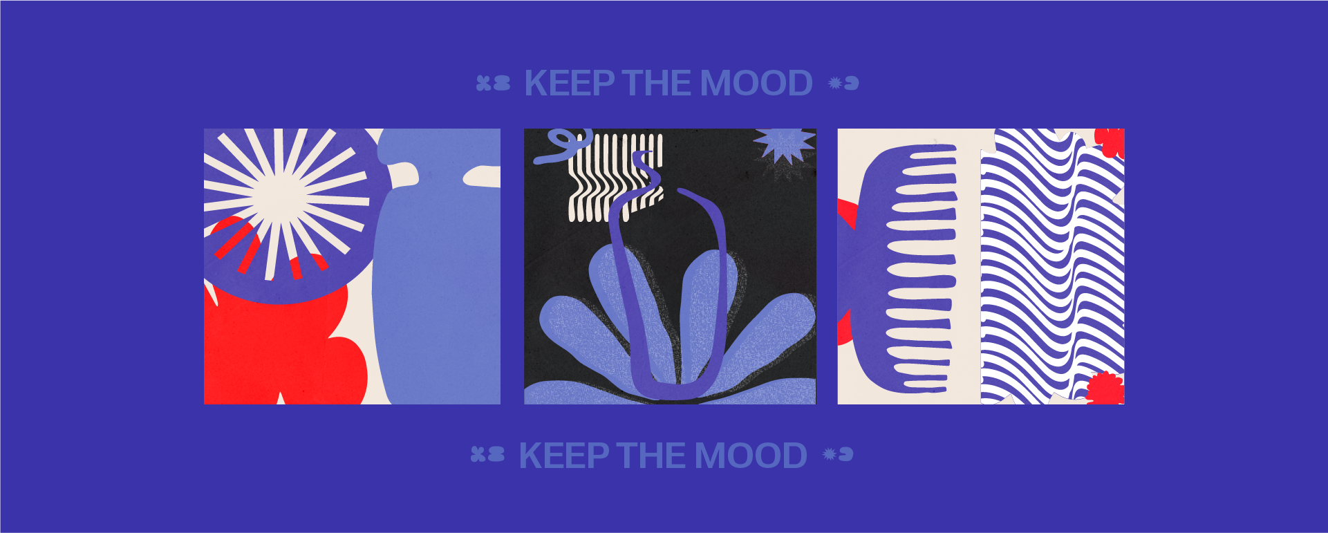
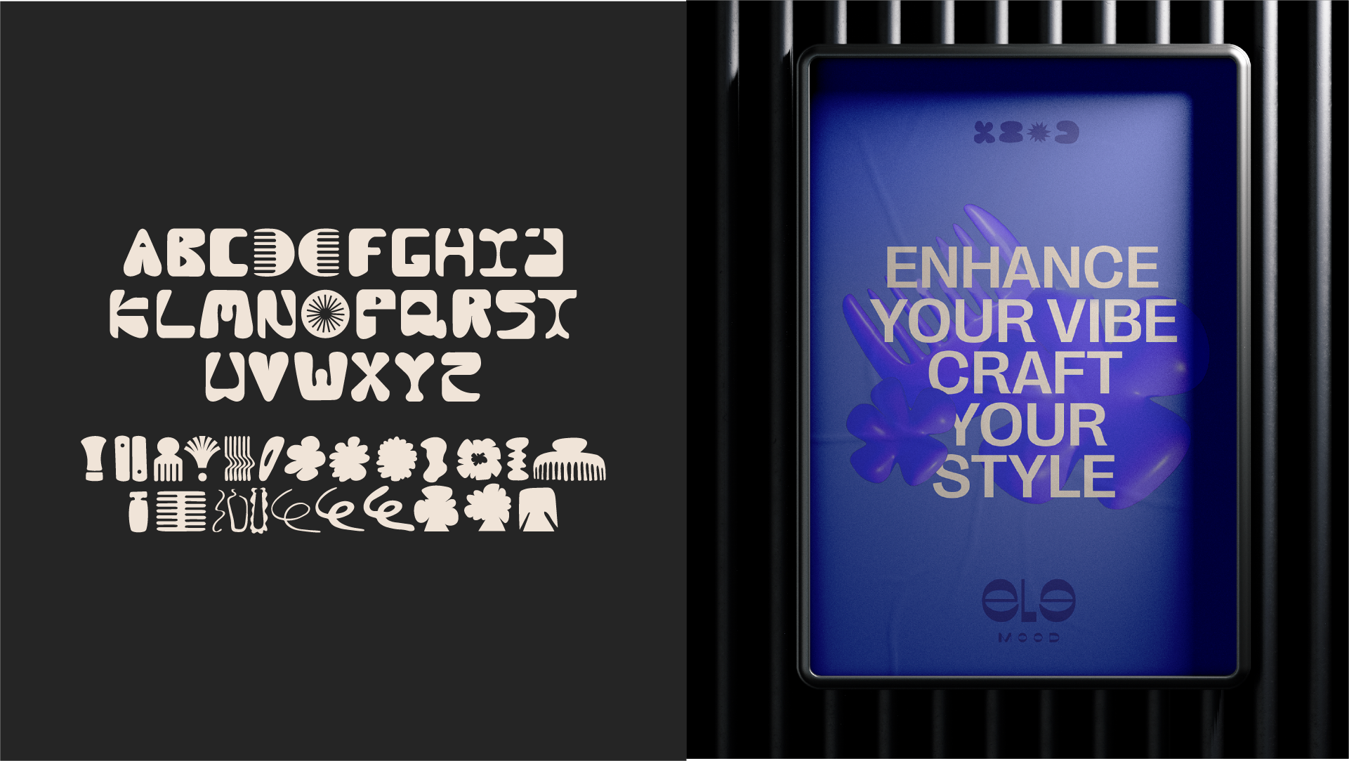
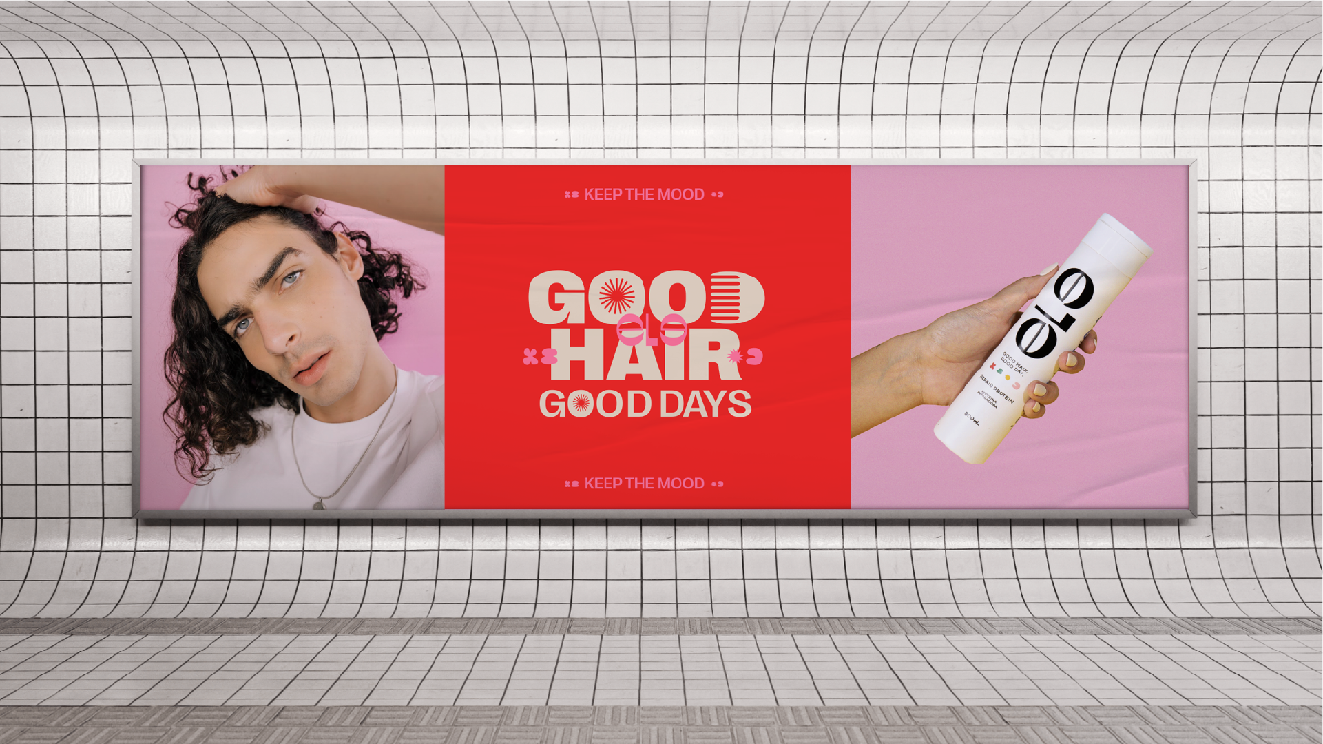
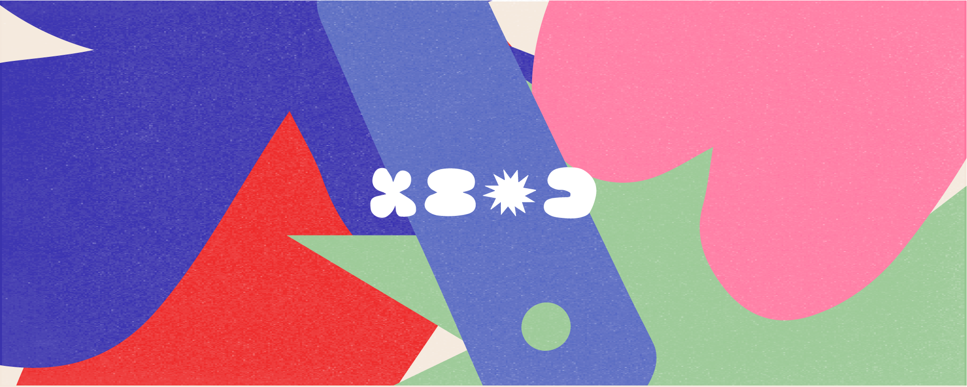
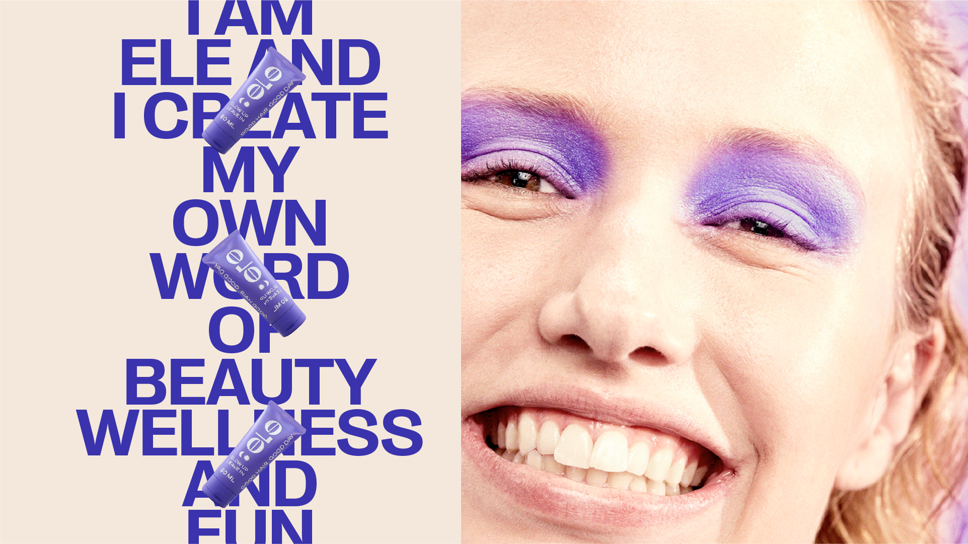
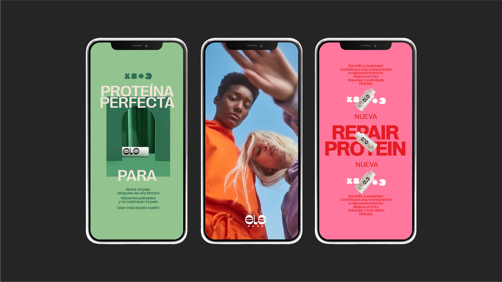
We defined Ele’s essence as young, irreverent, and vibrant. We built a modular graphic system based on irregular shapes and a custom alphabet inspired by hair elements: bubbles, foam, curls, combs. A vivid palette (purple, yellow, orange, green) amplifies the youthful spirit. We also set fresh, authentic photo guidelines.
The outcome
Ele Mood moved from diffuse to distinctive—a strong, commercial, easy-to-deploy system. A clear identity that stands out in beauty and connects with a young audience seeking products with personality.
No items found.