Case study

Our approach
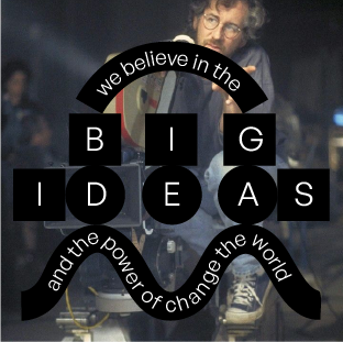
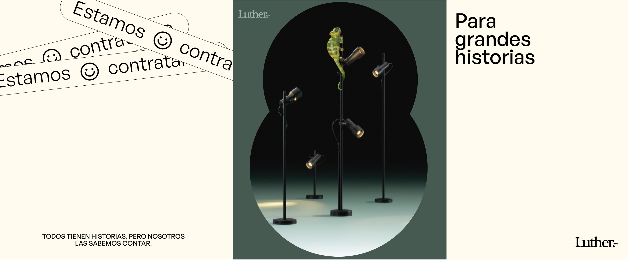
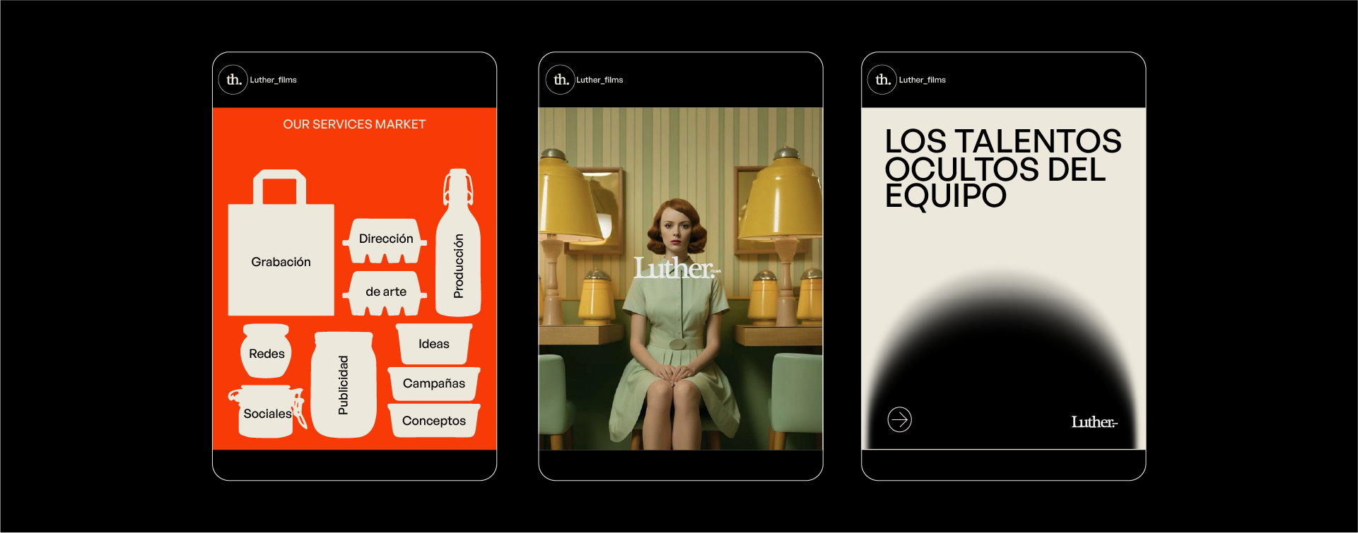
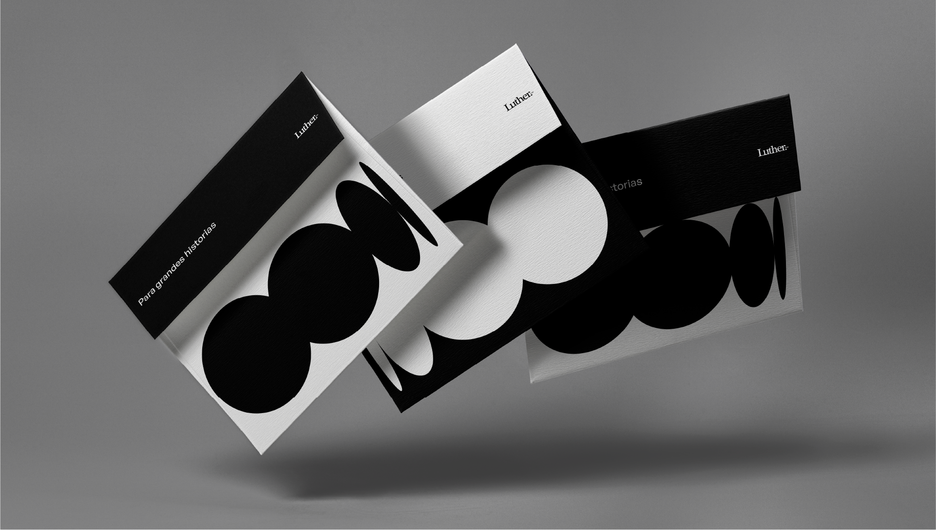
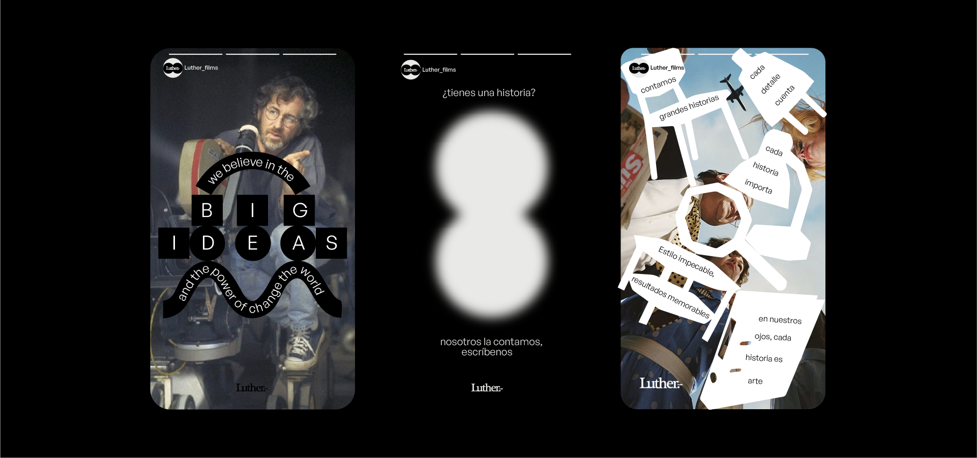
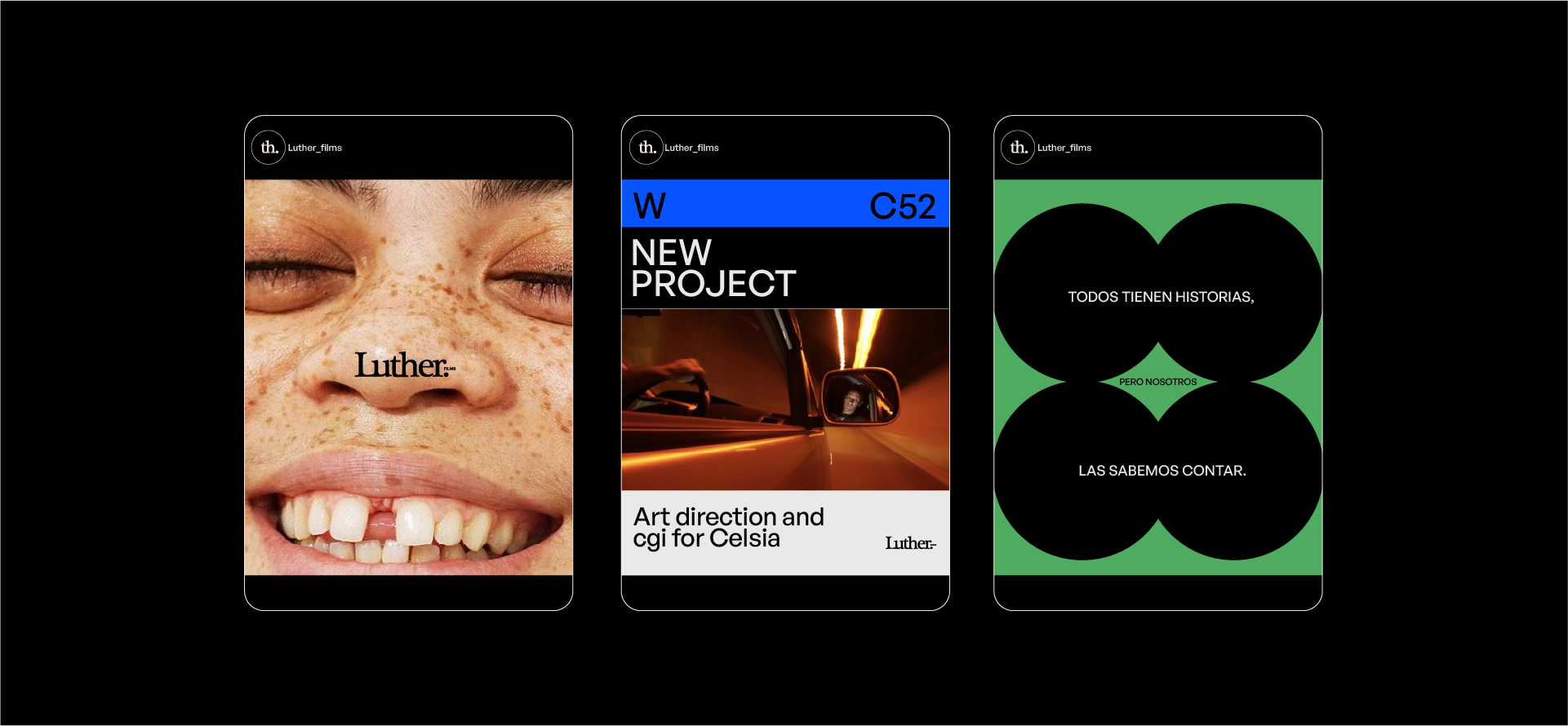
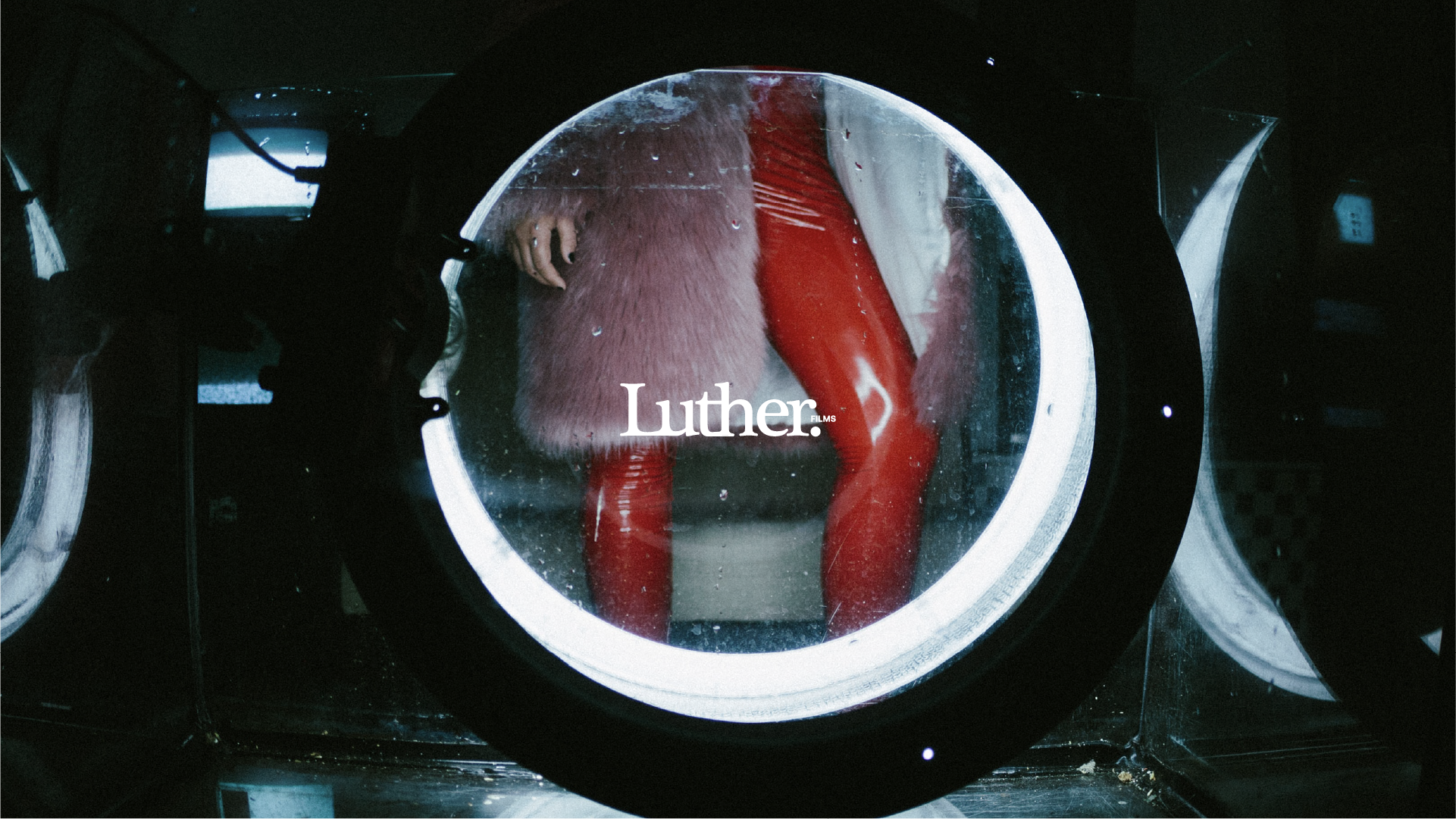
We built from a cinematic concept: the circle as a metaphor for the viewfinder that opens the door to new stories. The identity features cinematic photography and a palette rooted in RGB plus black & white. The tone is close yet refined—design-forward in every detail.
The outcome
Luther evolved into an aspirational production brand for the creative world—global in feel, trustworthy in execution, and a sought-after ally for telling visually powerful stories.
No items found.